
Our 3 Favorite Rebrands of 2023 and Why They're So Good
In the ever-evolving world of branding, 2023 witnessed several iconic companies undergo transformative rebrands. These rebrands showcased the delicate balance between embracing modernity and preserving brand heritage. From global beverage giants to fashion powerhouses and tech disruptors, there were a few companies that masterfully navigated the rebranding process, leaving an indelible mark on the marketing landscape.
Successful Rebrands of 2023
While there were a lot of rebrands in 2023, our top three favorites were Pepsi, Burberry and, Reddit.
Pepsi
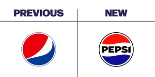
Let’s get the elephant in the room out of the way first: the Pepsi “smile” is dead. Huzzah!
If you’re unfamiliar, Pepsi signed on with the Arnell Group in 2008, looking to refresh their 1998 branding for the new millennium. The design strategy document for the rebrand was leaked, revealing a truly generational hodge-podge of corporate marketing schlock that still reverberates through branding today. The document was memed to oblivion, demonstrating the heretofore unseen height of corporate buzzword nonsense. Pepsi's rebrand, timed to coincide with its 125th anniversary, was a calculated move that paid off handsomely. The new logo, a modern take on the 1973 classic, exuded energy and confidence through its bold typography, drawing on the strength of a legacy brand that’s intertwined with American culture. Being able to reach back into your company's own storied heritage is a brand flex. The execution seamlessly connects future generations with Pepsi's rich heritage, while also giving older generations something nostalgic to latch onto.
From a marketing standpoint, Pepsi's rebrand was a resounding success. The in-house design team, led by Chief Design Officer Mauro Porcini, struck the perfect balance between innovation and nostalgia. The deeper electric blue, accented by black, lent a vibrant contrast, while the new can silhouette and the signature Pepsi pulse evoked the brand's association with music and energy.
Key Aspects of the New Pepsi Logo:
- Upgraded globe with bold typography: The new logo centers the brand name in the design, using uppercase fonts to make a bolder statement. The font is thicker and more striking, representing the brand's "unapologetic mindset."
- Electrifying color scheme: The color scheme was updated without drastic changes, maintaining the brand's iconic colors.
- Dropped 'smile' detail: The "smile" detail from the previous logo, which received backlash, was dropped for a cleaner classic version, bringing back symmetry to the logo.
Burberry
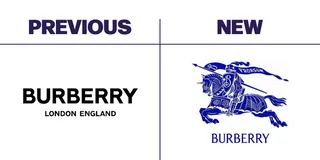
Burberry's rebrand in 2023 was a step into a new era under the creative direction of Daniel Lee. The rebrand aimed to push Burberry under a modern light while challenging its traditional roots. The new logo introduced the traditional Burberry lettering in a thin and elegant font, and the classic horse emblem was previewed with an illustrative outline in white and deep blue hues.
If Pepsi’s return to heritage was a flex, Burberry’s rewind is a full bodybuilding pose, both recalling the older 2000s logo (when the brand famously eschewed its growing “chav” connotations and pivoted to the premier luxury brand we know today) and subtly hinting at the brand’s ridiculously long lifespan, beginning in 1856. The logo change is a clear marker in the decades-long pendulum swing away from clean minimalism, with Burberry deciding to plant its flag firmly on the maximalist side.
The rebrand was part of a broader strategy to propel Burberry onto fresh grounds, with the Instagram account being wiped clean as a symbolic gesture of starting anew. The campaign featured U.K. talent and was set against the backdrop of London landmarks, emphasizing the brand's British heritage.
Key Aspects of the New Burberry Logo:
- Traditional lettering: The new logo features the traditional Burberry lettering, maintaining a connection to the brand's heritage.
- Classic horse emblem: The emblem is presented with an illustrative outline, blending tradition with a fresh aesthetic.
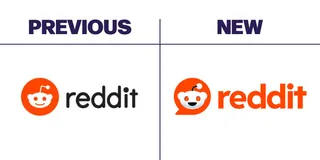
Reddit's rebrand in 2023 introduced a new logo, typeface, brand colors, and an update to their mascot, Snoo. Led by brand refresh superstar Pentagram (whose work you might recognize in the branding for Amazon Prime, or the typeface and motion graphics of Saturday Night Live or Wonka), the rebrand aimed to convey a more integrated, intuitive, and global look for the brand. The new 3D Snoo became visible on Reddit websites and served as the application icon. However, the rebranding received mixed reactions from the Reddit community.
The rebranding was a testament to Reddit's adaptability and forward-thinking approach. The changes made by Pentagram and Reddit's UX team reflect a deep understanding of the evolving digital landscape and a commitment to providing an engaging and contemporary experience to its users.
Key Aspects of the Reddit Rebrand:
- Bubble graphic device: Reddit introduced a unique and innovative visual element that represents a significant evolution in the platform's design.
- Emotional UX: The rebrand aimed to appeal to emotional UX with the cute Snoo 3D character, the familiar orange color, and a beautiful yet simple user interface.
- Applied brand image: Unlike many rebrandings, Reddit actually launched its redesign and applied it across the platform.
Your Next Rebrand?
Each of these three rebrands represents a strategic effort by the respective companies to modernize their identities while honoring their heritage, adapting to the evolving preferences of their audiences. Pepsi’s rebrand focused on energy and confidence, Burberry’s on modernizing its traditional roots, and Reddit’s on enhancing user experience and emotional connection.
The question now is, “Do you need a rebrand?” If you’re positive that you’re ready to rebrand, or if you need to consult with branding experts to determine if a rebrand is necessary, let’s chat.
Michael Cheng,
Account Manager