Typefaces for Dummies: The Basics of Finding a Branded Font
Choosing the right font for your brand can feel like a daunting task. With thousands of typefaces available, how do you know which one will best capture the essence of your business and connect with your target audience?
The truth is that your font choice is just as important as your logo or color palette when it comes to building a cohesive, memorable brand. The right typeface can elevate your marketing materials, website and overall visual identity. Select the wrong one and you risk looking amateurish or out-of-touch.
In this guide, we'll walk you through the fundamentals of font selection, from understanding basic classifications to strategies for pairing typefaces that complement your brand. By the end, you'll have the knowledge to choose a branded font that leaves a lasting impression.

Understanding Font Classifications
The first step in selecting the perfect font is familiarizing yourself with the four major typeface categories:
1. Serif Fonts
Characterized by the small decorative strokes at the ends of letters, serif fonts have a classic, formal look. Those decorative strokes can make it easier to read long blocks of text by letting our eye better grasp the shape of the word at a glance, which is why they are almost always the font of choice for printed books or e-readers. They work well for brands aiming to convey tradition, authority or sophistication - think Times New Roman or Georgia.
2. Sans-Serif Fonts
Clean and modern without any embellishments, sans-serif fonts offer a minimalist aesthetic. They’re on the other end of the print vs. digital spectrum and are the preferred font on screens for readability, adaptability and web-safety. From a branding standpoint, they're a great choice for tech companies and startups or any brand seeking a contemporary edge - examples include Arial and Helvetica.
3. Script/Handwritten Fonts
Flowing, calligraphic typefaces mimic the appearance of handwriting. Depending on the font, they can work beautifully for elegant, artisanal brands that want to evoke a sense of craftsmanship or they can work for fun, creative brands that want to appear relatable and personable - such as La Parisienne or Lucida Calligraphy.
4. Display Fonts
Highly stylized and attention-grabbing, display fonts don’t fit the serif, sans-serif or script molds. These are perfect for making a statement in headlines, logos and other prominent placements. Ideally, you should never use a display font for body copy; they’re intended for large headers and displays, hence the name. Popular options include Lobster and Amatic SC.
Choosing a Font That Aligns With Your Brand
Now that you understand the key font classifications, it's time to start thinking about which one will best represent your brand. Begin by evaluating your brand personality and desired image. Are you going for something classic and sophisticated? Modern and minimalist? Artisanal and creative?
The font you select should visually convey those brand attributes. For example, a sleek sans-serif typeface would pair well with a healthcare startup, while an elegant script font could elevate the branding of a luxury jewelry line.
It's also important to consider font psychology and the associations certain typefaces evoke. Serif fonts tend to be perceived as more serious and traditional, while sans-serifs feel clean and contemporary. On the other hand, script fonts can communicate a sense of warmth and craftsmanship. Understanding these psychological factors will help you choose a typeface that resonates with your target audience.
Of course, readability is key. No matter how visually compelling your font may be, it needs to remain legible across all your marketing materials - from website headlines to product labels.

Font Pairing Strategies
Once you've settled on a primary branded font, the next step is to pair it with complementary typefaces. This allows you to add visual interest and hierarchy to your designs.
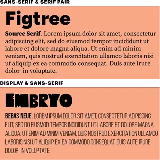
A classic pairing is combining a serif font for headlines with a sans-serif font for body copy. This creates an appealing contrast while maintaining readability. You could also pair a script font with a display font, using the former for signatures or callouts and the latter for impactful headlines.
The key is finding fonts that work in harmony, without competing for attention. Pay attention to factors like stroke thickness, character width and overall personality to ensure your typeface combinations feel cohesive.
Implementing Your Branded Typeface
With your ideal font duo selected, it's time to start implementing it across your brand assets. Consistency is crucial, so make sure you're using your branded typeface consistently on your website, marketing collateral, packaging and anywhere else your brand is represented. It’s important to maintain consistent hierarchies too - using the same font for headers vs. subheaders vs. pull quotes vs. body copy.
Don't forget to obtain the necessary font licenses to ensure you're using them legally. Many font families offer different license types depending on your needs, from basic desktop use to embedding on websites.
Finally, document your font choices in your brand book guidelines. This will help maintain a cohesive look and feel, even as your business grows and new team members come on board.
Final Thoughts
Choosing the right font for your brand may take some trial and error, but it's a critical step in crafting a memorable visual identity. By understanding font classifications, considering your brand personality and mastering pairing techniques, you can craft a typographical identity that elevates your marketing and sends the right message to your customers.
So don't be afraid to experiment - have fun exploring different fonts and see which one makes your brand shine. With the right typeface(s) in your toolkit, you'll be well on your way to building a cohesive, compelling brand that stands out from the crowd.
Ready to take your branding to the next level? Reach out to the experts at Elevate My Brand. Our team of marketing and design professionals can help you find the perfect font, develop a winning visual identity, and implement a comprehensive digital strategy to grow your business.
Michael Cheng,
Account Manager